Handover: A Mobile Grocery App

Overview
Handover is a subscription based food delivery app that addresses the high costs of food delivery apps and grocery shopping by introducing organizational tools to their user experience.
Scope & Constraints
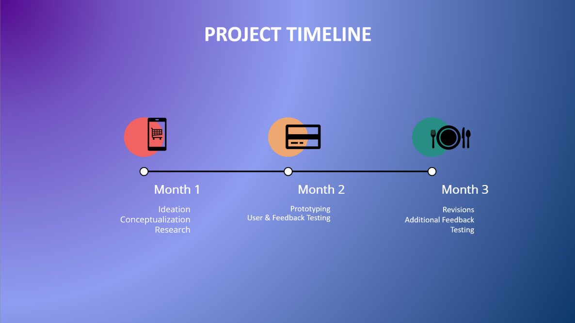
Time Constraints: 3 months (April 2021 – June 2021) to ideate, conceptualize, develop, and launch an app.
Scope: Develop an app to address user dissatisfaction with high cost and inefficient shopping/delivery experience common among other grocery & food delivery apps.
Tools I Used: Figma, Google Forms
We operated with these constraints along with an extremely low budget. Due to this, we used these tools to cut costs while retaining ease of use and the ability to keep up developing designs working with industry standard platforms.
Identifying the Problem
The purpose of this project is to focus on people’s dissatisfaction with high costs, long shopping and delivery times, scheduling, and organization.
We tried to address an audience of people who would benefit from an app that would reduce taking the time to do groceries through organization and cost analysis features.
Initial Thoughts
Process
Our starting point was identifying the pain points of using other grocery and delivery apps.
But before understanding the issues that grocery and delivery apps brought, I had to investigate who was using these apps in the first place. After, I wanted to better understand who used grocery and delivery apps. I wanted to ask what made users want to use these apps in the first place. I also wanted to better understand why they would choose either option of going to a grocery market instead or using an app to cut down time and simplify this action. In the context of these points of interest, I created a qualitative survey to learn more about user motivations.
Initial Survey Findings
My survey yielded 24 responses (N=24).Examining the data, I found that:
Users were put off by the high delivery costs
Current grocery delivery apps aren’t able to maximize efficiency in delivery times and scheduling
Inventory was typically limited
From the user interviews I conducted, some notable remarks from participants were:
“Service fees are too high, fees almost make the entire order double in total price. I wish scheduling delivery time options were also more flexible.”
“The orders were sometimes misunderstood and either too much or too little of an item was acquired. For some foods certain brands are preferred so it would be ideal to add additional details or expand on specific qualities that I want in the groceries.”
“There are limited menus or limited restaurants. Also not as good quality as in person dining.”
I wanted to address these concerns in the development of Handover by:
Streamlining the accessible savings and features, like the coupon book, for the user to be more prominent, visible, and accessible.
Incorporating delivery scheduling to be a part of the user flow
Giving users the ability to shop from multiple stores to account for issues of limited inventories.
Competitive Analysis
In order to make a competitively working and strong product, I conducted an analysis of other grocery and food delivery apps along with several papers on their social impact and conducted a survey to learn more about how users felt along with their experiences of any food delivery and grocery apps they used.
The 7 of the most downloaded delivery apps: Doordash, Instacart, Uber Eats, Grubhub, Postmates, Fantuan Delivery, and Walmart, shared common qualities and design models that made them successful and effective. I cross-compared their features to establish baseline functionality of a grocery delivery app while taking note of their definitive features that made them unique in the mobile app delivery market.
I, along with my team, cross compared and examined the common features belonging to the apps we used as reference and study material to establish base functionality for a fully operating app. From the data we recorded, we came across 24 notable features common across those 7 apps.. Across these 24 ideas, 12 features made it through to establish a baseline standard grocery delivery app.
I desired 2 solutions set apart from those original 12 ideas to give our app personality and fulfill the concerns of our user research findings.
After conducting user interviews about these apps, I narrowed down the issues that each application had and measured them with the issues that I wanted to solve.

Executing the Process
Feature Ideation & Lo-fi Wireframing
I rapidly came up with a flowchart and a lo-fi wireframe on Figma to see the channels of information and interaction that our app needed in order to function. This also allowed us to set a precedent for ourselves to stick to the course of creating an app that wasn’t cluttered by many features.
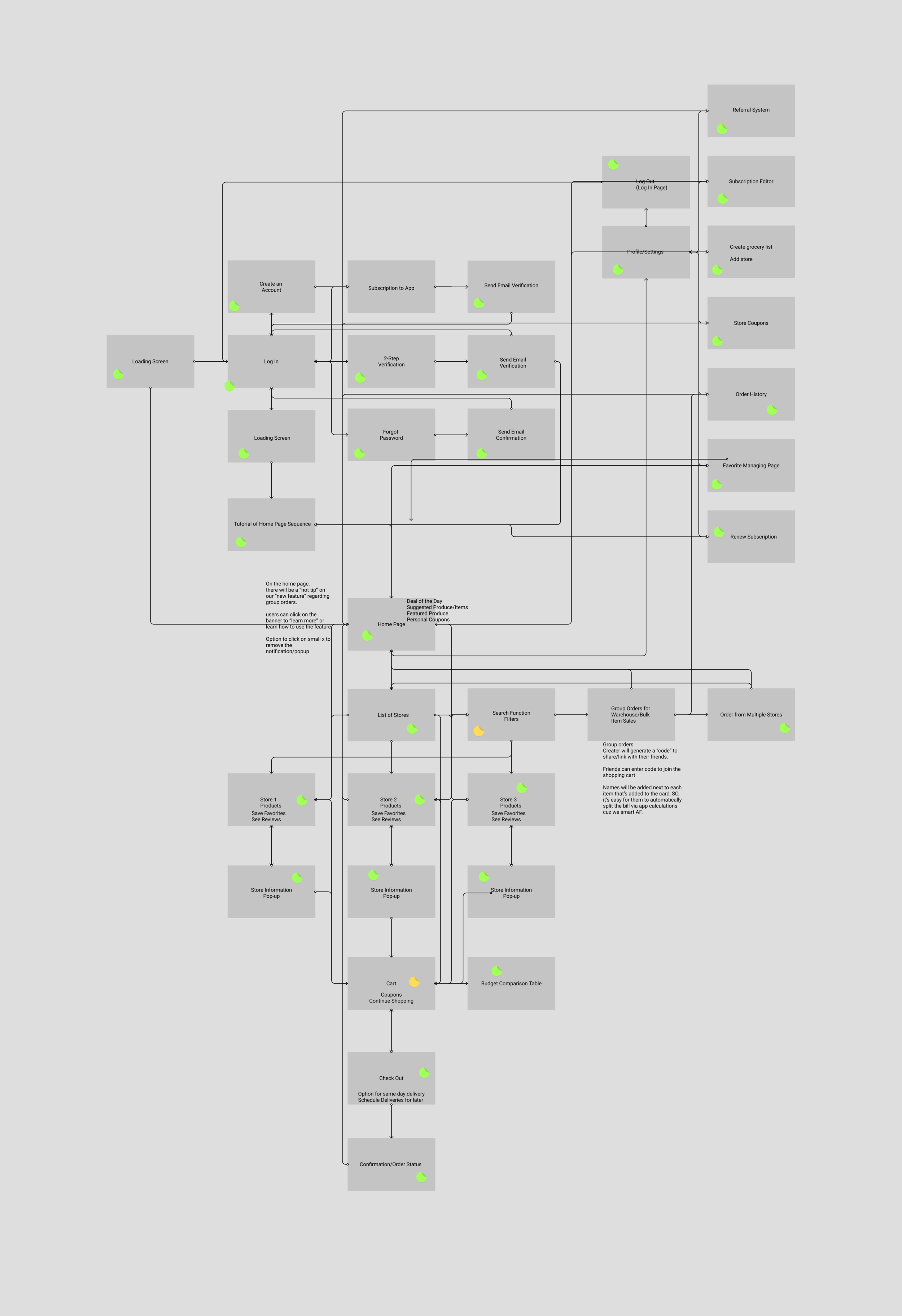
Flowchart
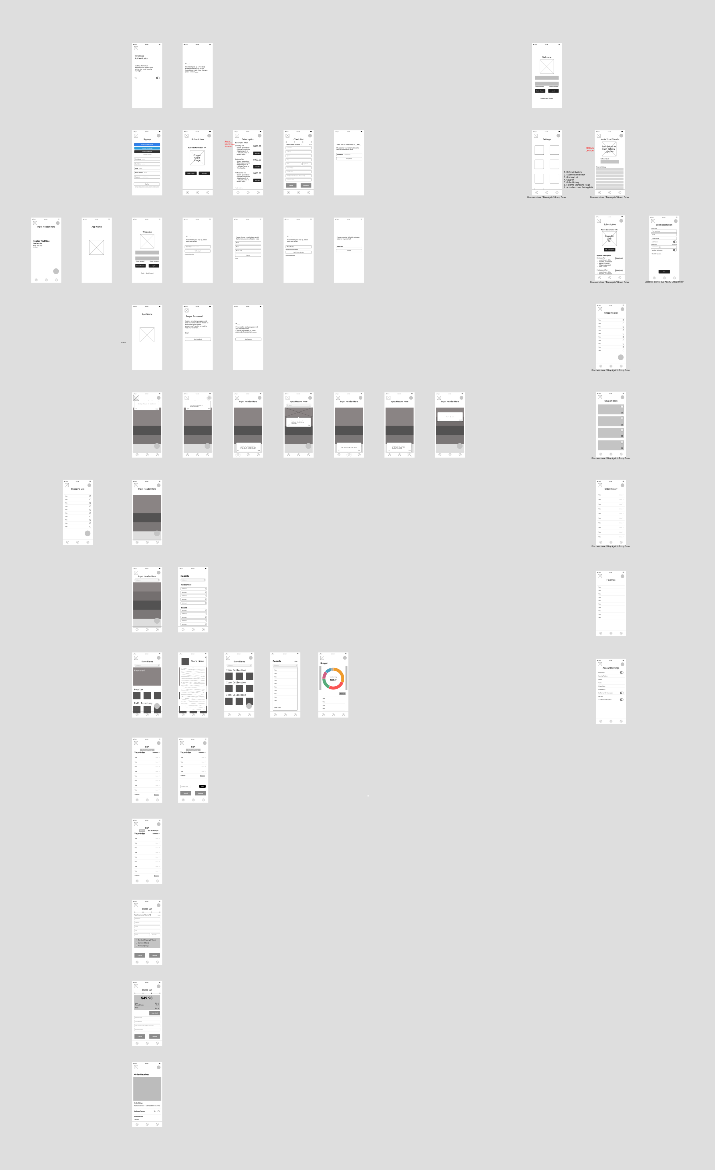
Lo-Fi Wireframe (full frame available here)
Hi-Fidelity Wireframing
Once our flowchart was finished and our skeleton wireframe was set in place, I began to work on the personality of Handover.
We divided the work with me designing the landing pages, store pages, product pages, cart, and checkout and confirmation pages.
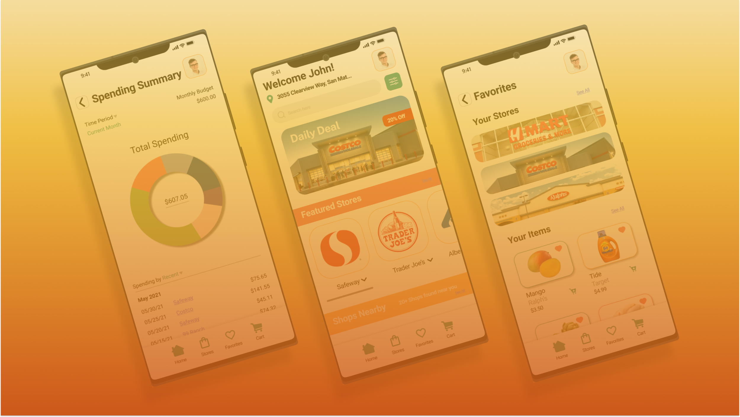
I weighed in on developing saving grocery lists along with the Spending Summary tool. For this part of the development process, we primarily used Figma and Photoshop to create our brand logo and prototype to show animated frames.

Hi-fidelity Wireframe Kit (full frame available here)
Pilot User Study
After finishing the high-fidelity wireframe kit, I conducted a set of user walkthrough interviews to see how the app performed. I gathered 5 participants from previous interviews who had seen the lesser versions of the wireframe kit to be able to establish a firm grasp of how changes and edits were made throughout the process. I wanted to measure users’ motivations to use Handover over competitors by examining the features’ visibility and usefulness in being able to organize and cut down time shopping.
I had users perform a set of actions that included navigating through Handover’s interface and purchasing products. After performing basic functionality performance tests, I had the participants attempt to use each of our distinct features to examine and measure their effectiveness.
The last part of this user study was a discussion to see how the participants felt about using the app in comparison to the other prominent grocery and food delivery apps.
Results & Analysis
I separated users’ responses into thought processes in navigation and their opinions and feelings regarding their experience using Handover.
Here is where I learned how important it is to take a step back from the project you’re designing or developing. Without these user tests, we would not have learned how difficult balancing business goals along with improvements in design is.
Findings
I found that:
Increasing the areas of access towards coupons and instant savings regarding their order convinced users to continue browsing and shopping for groceries. We organized and tied savings and coupon cards to store specific interfaces to able to test.
Participants felt that the Budget Summary and Favorites Listing tools available to them in the app addressed the concerns of tediousness in shopping or browsing through many listings for the items they want.
The ability to shop and receive an order composed of selections from multiple stores absolved the users’ concerns about limited inventory selections without having to worry about submitting multiple orders.
In conclusion, having to manually access these savings proved to be a worthwhile change to implement in the product design of a grocery delivery app. Yet, it begs to ask why we didn’t just make the savings automatically apply. And as we tested, we also found that having the feedback loop that these savings do exist instead of automatically being applied validates the user. Based on their response to an automatic application, the user operates based off of the assumption that these savings are or aren’t applied. Visibility was the key player in solving that issue of curbing high costs in ordering and processing.
The Budget Summary tool proved to be helpful to users who wanted to make shopping for groceries effectively by seeing what their budget can break down into in terms of categorizing their own selection. These tools reduced the amount of time shopping and browsing with all the relevant information they require to shop being brought up to them in one frame.
Including the option to be able to submit a single order curating items from multiple stores proved to be effective at addressing users’ concerns about limited inventory. However, this brought up a further development in that user participants became concerned about how to make the business model more effective and worthwhile for workers and drivers as compared to the overall app design.
Reflections
Participants were able to navigate through Handover’s interface with ease after the first user testing phase. This also allows us to work with more space by reducing the amount of information on a screen, especially a mobile screen with limited space. The phrase “less is more,” goes a long way here.
Users were concerned about high costs, scheduling and delivery time issues, along with limited inventory selections. These issues were found to be heavily tied to how operations became the foundation for this app. Optimizing navigation channels and offering multiple ways to tie not only the user needs in the order processing page proved to be an underdog quality that we did not expect to drive user interest.
Throughout the duration of this study, we also found the importance of factoring in the workers’ and drivers’ needs along with general users to be able to make this entire operation run smoothly. There were more sides to the user end of grocery and delivery apps. My sentiment regarding how consumers should not be the only audience considered to be “consuming” the content of the app, but the people who perform the operation to make the business model work.
Apart from factoring in the workers’ and drivers’ needs to our design solutions, I saw that our research could have been conducted better. Our research was based entirely qualitative which validated and explored user concerns and opinions. But upon conducting the study and designing solutions to building this app better, I found that we would have a better understanding of the audience by pinpointing the qualities of their demographics through a quantitative study.
These lessons taught me the importance of understanding the motivations of the audience who not only consume but use the app to make the business model operable. I also learned that increasing the scope of research methodologies can better help us as designers and researchers learn how to develop these ideas in directions that address the needs of the users. Overall, I want to take the lessons I learned from this experience and use them as a way to improve my own design process.
Thank you for taking the time to read my case study on a mobile grocery delivery app.